Custom Theme
A theme in Lodestone works like a layout, that will be rendered as a wrapper for all pages. This docs will walk you through the process of creating a custom theme.
Optionally, you can deploy an example and build further on it by following the below steps:
Create a Custom Theme
Configure Lodestone to Use the Theme
First, you need to tell Lodestone to use your custom theme file instead of official ones. In your Next.js config, you can pass the path to your theme file to the Lodestone plugin:
const withLodestone = require('Lodestone')({
  theme: './theme.tsx',
})

module.exports = withLodestone({
  // Other Next.js configurations
  ...
})
Create a Basic Theme
You can now start working on your theme! In your root directory, create the
corresponding theme.tsx file with basic content:
import type { LodestoneThemeLayoutProps } from 'Lodestone'

export default function Layout({ children }: LodestoneThemeLayoutProps) {
  return (
    <div>
      <h1>My Theme</h1>
      <div style={{ border: '1px solid' }}>{children}</div>
    </div>
  )
}
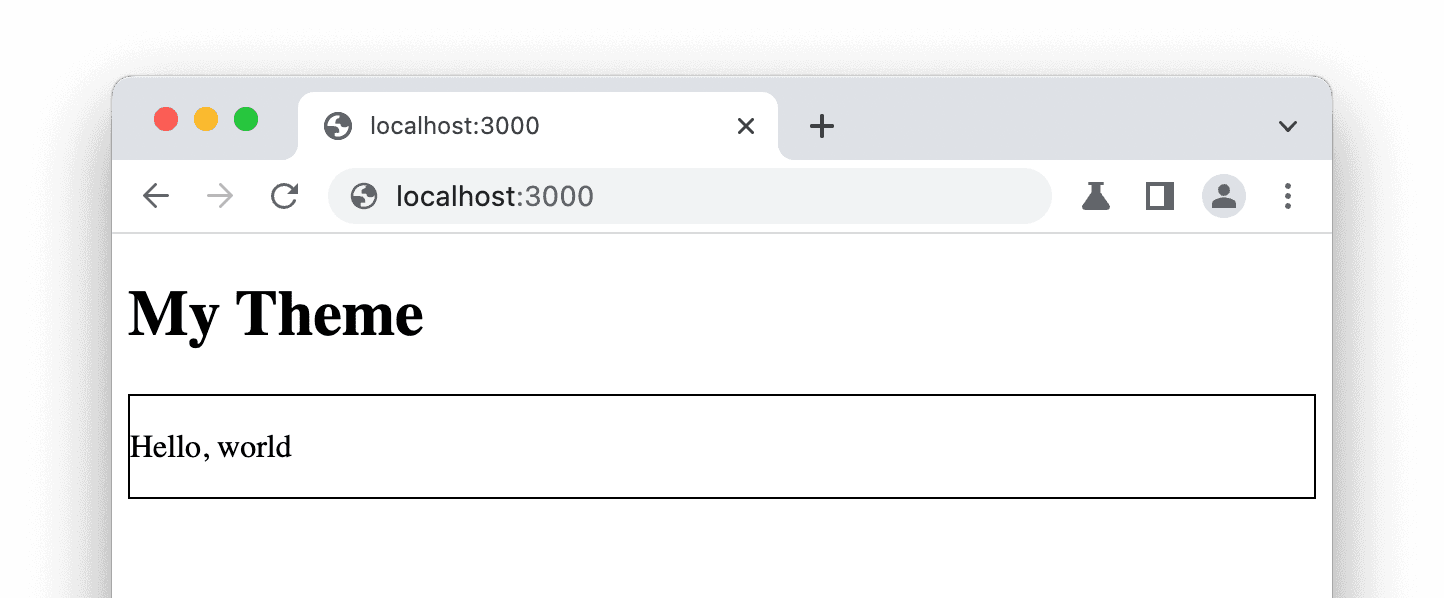
It accepts a children prop, which is the MDX content of the current page, and
wraps some other elements around the content. After creating the theme, you can
simply add a MDX file as pages/index.mdx and see the result:

Inside your theme layout, you can use CSS imports or other ways to style it.
Next.js hooks such as useRouter, Head are also available.
Render Metadata for the Active Page
Other than children, some other useful props are passed to the theme layout
too. With the pageOpts props, the theme can access the page’s meta
information.
For example, let’s implement these features:
- Render the page title in
<title> - Show a simple table of contents
- Add a meta tag for
og:imagevia the front matter
import Head from 'next/head'
import type { LodestoneThemeLayoutProps } from 'Lodestone'

export default function Layout({ children, pageOpts }: LodestoneThemeLayoutProps) {
  const { title, frontMatter, headings } = pageOpts

  return (
    <div>
      <Head>
        <title>{title}</title>
        <meta name="og:image" content={frontMatter.image} />
      </Head>
      <h1>My Theme</h1>
      Table of Contents:
      <ul>
        {headings.map(heading => (
          <li key={heading.value}>{heading.value}</li>
        ))}
      </ul>
      <div style={{ border: '1px solid' }}>{children}</div>
    </div>
  )
}
Use Page Map of the Entire Site
Now, if you want to render something like a sidebar or a navigation bar, which
relies on information of not only the current page but also other pages, you can
use the pageMap value.
For example, we can render a simple navigation list with all the pages in the top level:
import Link from 'next/link'
import type { LodestoneThemeLayoutProps } from 'Lodestone'

export default function Layout({ children, pageOpts }: LodestoneThemeLayoutProps) {
  const { pageMap } = pageOpts

  return (
    <div>
      <h1>My Theme</h1>
      {pageMap.map(item => {
        if (item.kind === 'MdxPage') {
          return (
            <Link key={item.name} href={item.route}>
              {item.route}
            </Link>
          )
        }
        return null
      })}
      <div style={{ border: '1px solid' }}>{children}</div>
    </div>
  )
}
There are other item kinds such as Folder (for directories) and Meta (for
_meta.json files). All the items are typed so you can easily know the
properties.
Advanced Usage
Docs for advanced usage are under construction.